Vistaar WebX Brand Development Agency

website clarity

what your website is accidentally telling visitors about a business

What Your Website Is Accidentally Telling Visitors About Your Business

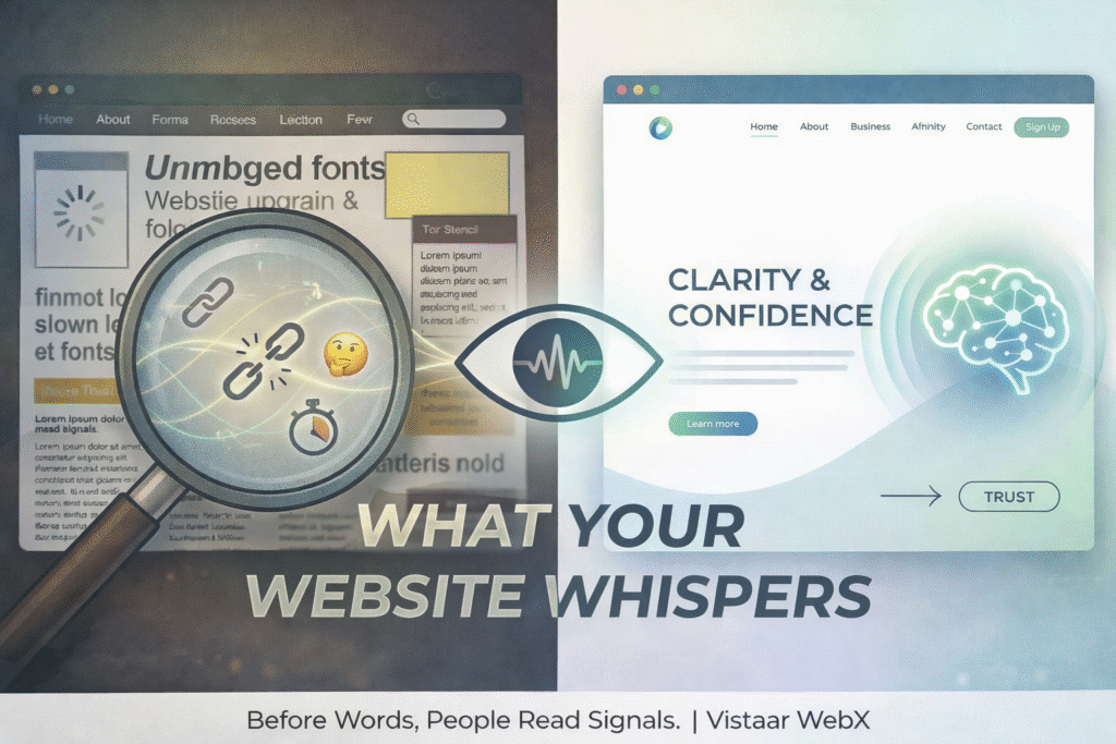
Most websites say more than businesses realise. Not through slogans or headlines. Not through carefully written “About Us” sections. But through small signals that visitors pick up without thinking. Before someone understands what you offer, they form an opinion about who you are. That judgment happens quietly, and it’s often based on things you never intended to communicate. What your website is accidentally telling visitors often becomes clear before they read a single word. Before Words, People Read Signals Visitors don’t arrive ready to analyse your website. They arrive cautious. They notice how fast the site loads. They notice whether things feel organised or slightly chaotic. They notice whether the website feels current or neglected. None of this is conscious. But it shapes trust immediately. A slow site suggests carelessness. A cluttered layout suggests confusion. An outdated design suggests a business that hasn’t kept up. Even if none of those things are true. Inconsistency Speaks Louder Than Content When different pages sound like they were written by different people at different times, visitors feel it. One page is formal. Another is overly casual. Another feels sales-heavy. That inconsistency quietly suggests a lack of clarity inside the business itself. If the brand isn’t sure how to speak, visitors wonder what else might be unclear. Consistency doesn’t mean everything looks the same. It means everything feels connected. What Silence Can Say Sometimes the strongest message is what’s missing. There’s no clear sense of who the business is meant for. The next step isn’t obvious. And for someone visiting for the first time, reassurance is missing. When key information is absent, people don’t assume you’ll explain it later. They assume you didn’t think about it. Unanswered questions create hesitation. Hesitation creates exits. Design Choices Reflect Confidence A website that tries to say everything at once usually feels insecure. Too many sections. Too many messages. Too many calls to action competing for attention. On the other hand, a website that chooses what not to show feels confident. Space feels intentional. Content feels considered. Visitors don’t interpret this as minimalism. They interpret it as clarity. Tone Reveals More Than Strategy Visitors may not read every word, but they absorb how the words sound. Is the language trying too hard to impress? Does it feel defensive or overly explanatory? Or does it sound calm and sure of itself? Tone signals how comfortable a business is with its own value. When the tone feels steady, people relax. When it feels forced, they become cautious. The Unintentional Story Your Website Tells Every website tells a story, whether planned or not. It tells visitors how much attention you pay to detail. How clearly you think. How seriously you take their time. That story forms before anyone clicks a button. A Thought to End On A website doesn’t need to say everything. It needs to say the right things clearly, and leave the rest quiet. At Vistaar WebX, we’ve seen that the most effective websites aren’t the most impressive-looking ones. They’re the ones that feel intentional, consistent, and thought through. Visitors may not remember your exact words. But they will remember how your website made them feel and what it quietly told them about your business

What Your Website Is Accidentally Telling Visitors About Your Business Read More »

business website first impression design

What People Notice First When They Visit a Business Website

Most people don’t read a website the way businesses expect them to. They don’t start at the top. They don’t carefully follow the structure. They don’t absorb everything you’ve written. They scan. They pause. They make quick judgments, often without realising it. And within those first few moments, an opinion forms. Sometimes it’s clear. Sometimes it’s vague. But it’s rarely neutral. What’s interesting here is that what people notice first is rarely what businesses think they notice. It Starts With a Feeling, Not a Feature Before visitors understand what you offer, they register how the website feels. Is it calm or cluttered? Clear or slightly overwhelming? Confident or hesitant? This reaction happens almost immediately. Long before someone reads a headline or checks a service page, they’re already deciding whether staying makes sense. A website that feels organised and intentional encourages exploration. One that feels busy or confusing creates quiet resistance. People may not be able to explain this feeling, but they act on it anyway. Visual Order Is Not the Same as Design Good design, though, isn’t just about looking modern. What visitors really notice is visual order. How easily their eyes move. Whether elements feel aligned. Whether spacing gives them room to breathe or forces them to work harder than necessary. A website can have attractive colours and still feel uncomfortable to navigate. When there’s too much happening at once, multiple messages competing for attention, people disengage faster than expected. Clarity, not decoration, is what usually holds attention. Headlines Get Read Before Anything Else If someone reads anything at all, it’s usually the main headline. Not the subtext. Not the buttons. Not the paragraphs below. That headline quietly answers a few questions: Am I in the right place? Is this relevant to me? Do I want to continue? When the headline is vague or overly clever, visitors hesitate. When it’s clear and grounded, they move forward, even if they don’t consciously realise why. People Notice What’s Missing Too Sometimes what stands out most is what isn’t there. No clear explanation. No sense of who the business is for. No obvious next step. When key information feels absent, people don’t search harder – they leave. This happens often with businesses that assume visitors already understand them. Online, that assumption rarely holds. Silence and ambiguity create friction just as quickly as clutter. Tone Shapes Trust More Than Words Visitors don’t analyse tone. They absorb it. Does the website sound human or overly formal? Confident or defensive? Helpful or self-focused? Tone comes through in small ways,  how services are described, how sentences are structured, how direct the language feels. Even without reading closely, people sense whether a website is speaking to them or at them. That sense plays a big role in whether trust begins to form. The First Scroll Is a Decision Point By the time someone scrolls once, a decision has already been made. Scrolling usually means interest. In contrast, Not scrolling often means doubt. That first scroll happens only if the top of the page gives enough clarity and comfort to continue. It doesn’t need to explain everything. It just simply needs to feel worth another moment. That’s a small window, and an important one. A Thought to End On A business website isn’t experienced line by line. Instead it’s experienced in impressions. People notice clarity before content, structure before strategy, and tone before detail. At Vistaar WebX, we’ve seen how small changes in layout, messaging, and flow can completely shift how a website is perceived, often without changing what the business actually offers. At the start of a new year, many businesses focus on adding more. Often the bigger impact comes from noticing what visitors already see, and how quickly they see it.

What People Notice First When They Visit a Business Website Read More »